

EXPAND ALL
- Home
- About Pixie
- Installing Pixie
- Using Pixie
- Tutorials
- Reference

In the previous two tutorials, you learned how to write a Vis Spec to visualize PxL script query output in the form of a table and time series chart.
In this tutorial, we will add a graph to our Live View. This graph will map all of the connections that Pixie has automatically traced between the pods in your cluster.
We will continue to use the Live UI's Scratch Pad to develop our scripts. Let's set it up with the final version of the code we developed in Tutorial #4:
Open Pixie's Live UI.
Select the Scratch Pad script from the script drop-down menu in the top left.
Open the script editor using the keyboard shortcut: ctrl+e (Windows, Linux) or cmd+e (Mac).
Replace the contents of the PxL Script tab with the following:
1# Import Pixie's module for querying data2import px34def network_traffic_per_pod(start_time: str):56 # Load the `conn_stats` table into a Dataframe.7 df = px.DataFrame(table='conn_stats', start_time=start_time)89 # Each record contains contextual information that can be accessed by the reading ctx.10 df.pod = df.ctx['pod']11 df.service = df.ctx['service']1213 # Calculate connection stats for each process for each unique pod.14 df = df.groupby(['service', 'pod', 'upid']).agg(15 # The fields below are counters per UPID, so we take16 # the min (starting value) and the max (ending value) to subtract them.17 bytes_sent_min=('bytes_sent', px.min),18 bytes_sent_max=('bytes_sent', px.max),19 bytes_recv_min=('bytes_recv', px.min),20 bytes_recv_max=('bytes_recv', px.max),21 )2223 # Calculate connection stats over the time window.24 df.bytes_sent = df.bytes_sent_max - df.bytes_sent_min25 df.bytes_recv = df.bytes_recv_max - df.bytes_recv_min2627 # Calculate connection stats for each unique pod. Since there28 # may be multiple processes per pod we perform an additional aggregation to29 # consolidate those into one entry.30 df = df.groupby(['service', 'pod']).agg(31 bytes_sent=('bytes_sent', px.sum),32 bytes_recv=('bytes_recv', px.sum),33 )3435 # Filter out connections that don't have their service identified.36 df = df[df.service != '']3738 return df3940def network_traffic_timeseries(start_time: str):4142 # Load the `conn_stats` table into a Dataframe.43 df = px.DataFrame(table='conn_stats', start_time=start_time)4445 # Each record contains contextual information that can be accessed by the reading ctx.46 df.pod = df.ctx['pod']4748 # Window size to use on time_ column for bucketing.49 ns_per_s = 1000 * 1000 * 100050 window_ns = px.DurationNanos(10 * ns_per_s)51 df.timestamp = px.bin(df.time_, window_ns)5253 # Calculate connection stats for each unique pod / upid / timestamp pair.54 df = df.groupby(['pod', 'upid', 'timestamp']).agg(55 # The fields below are counters per UPID, so we take56 # the min (starting value) and the max (ending value) to subtract them.57 bytes_sent_min=('bytes_sent', px.min),58 bytes_sent_max=('bytes_sent', px.max),59 bytes_recv_min=('bytes_recv', px.min),60 bytes_recv_max=('bytes_recv', px.max),61 )6263 # Calculate connection stats over the time window.64 df.bytes_sent = df.bytes_sent_max - df.bytes_sent_min65 df.bytes_recv = df.bytes_recv_max - df.bytes_recv_min6667 # Calculate connection stats for each unique pod / timestamp pair. Since there68 # may be multiple processes per pod we perform an additional aggregation to69 # consolidate those into one entry.70 df = df.groupby(['pod', 'timestamp']).agg(71 bytes_sent=('bytes_sent', px.sum),72 bytes_recv=('bytes_recv', px.sum),73 )7475 # The timeseries chart widget expects a `time_` column76 df.time_ = df.timestamp77 df = df.drop('timestamp')7879 return df
Vis Spec tab with the following:1{2 "variables": [3 {4 "name": "start_time",5 "type": "PX_STRING",6 "description": "The relative start time of the window. Current time is assumed to be now",7 "defaultValue": "-5m"8 }9 ],10 "widgets": [11 {12 "name": "Network Traffic per Pod",13 "position": {14 "x": 0,15 "y": 0,16 "w": 12,17 "h": 318 },19 "func": {20 "name": "network_traffic_per_pod",21 "args": [22 {23 "name": "start_time",24 "variable": "start_time"25 }26 ]27 },28 "displaySpec": {29 "@type": "types.px.dev/px.vispb.Table",30 "gutterColumn": "status"31 }32 },33 {34 "name": "Bytes Sent",35 "position": {36 "x": 0,37 "y": 3,38 "w": 6,39 "h": 340 },41 "globalFuncOutputName": "resource_timeseries",42 "displaySpec": {43 "@type": "types.px.dev/px.vispb.TimeseriesChart",44 "timeseries": [45 {46 "value": "bytes_sent",47 "mode": "MODE_LINE",48 "series": "pod"49 }50 ],51 "title": "",52 "yAxis": {53 "label": "Bytes sent"54 },55 "xAxis": null56 }57 },58 {59 "name": "Bytes Received",60 "position": {61 "x": 6,62 "y": 3,63 "w": 6,64 "h": 365 },66 "globalFuncOutputName": "resource_timeseries",67 "displaySpec": {68 "@type": "types.px.dev/px.vispb.TimeseriesChart",69 "timeseries": [70 {71 "value": "bytes_recv",72 "mode": "MODE_LINE",73 "series": "pod"74 }75 ],76 "title": "",77 "yAxis": {78 "label": "Bytes received"79 },80 "xAxis": null81 }82 }83 ],84 "globalFuncs": [85 {86 "outputName": "resource_timeseries",87 "func": {88 "name": "network_traffic_timeseries",89 "args": [90 {91 "name": "start_time",92 "variable": "start_time"93 }94 ]95 }96 }97 ]98}
RUN button or keyboard shortcut: ctrl+enter (Windows, Linux) or cmd+enter (Mac).To help you visualize what is happening in your Kubernetes cluster, let's add a graph that maps all of the connections that Pixie has automatically traced between the pods in your cluster. This will allow you to quickly see which pods are communicating with each other.
To do this, we'll first need to add a new PxL script function. This function will output a table of data that we can use to populate our graph. The graph widget requires a "fromColumn" and "toColumn" to create a graph. We can also supply additional columns that can be used to create the graph edge weight or hover info.
PxL Script tab with the following:1# Import Pixie's module for querying data2import px34def network_traffic_per_pod(start_time: str):56 # Load the `conn_stats` table into a Dataframe.7 df = px.DataFrame(table='conn_stats', start_time=start_time)89 # Each record contains contextual information that can be accessed by the reading ctx.10 df.pod = df.ctx['pod']11 df.service = df.ctx['service']1213 # Calculate connection stats for each process for each unique pod.14 df = df.groupby(['service', 'pod', 'upid']).agg(15 # The fields below are counters per UPID, so we take16 # the min (starting value) and the max (ending value) to subtract them.17 bytes_sent_min=('bytes_sent', px.min),18 bytes_sent_max=('bytes_sent', px.max),19 bytes_recv_min=('bytes_recv', px.min),20 bytes_recv_max=('bytes_recv', px.max),21 )2223 # Calculate connection stats over the time window.24 df.bytes_sent = df.bytes_sent_max - df.bytes_sent_min25 df.bytes_recv = df.bytes_recv_max - df.bytes_recv_min2627 # Calculate connection stats for each unique pod. Since there28 # may be multiple processes per pod we perform an additional aggregation to29 # consolidate those into one entry.30 df = df.groupby(['service', 'pod']).agg(31 bytes_sent=('bytes_sent', px.sum),32 bytes_recv=('bytes_recv', px.sum),33 )3435 # Filter out connections that don't have their service identified.36 df = df[df.service != '']3738 return df3940def network_traffic_timeseries(start_time: str):4142 # Load the `conn_stats` table into a Dataframe.43 df = px.DataFrame(table='conn_stats', start_time=start_time)4445 # Each record contains contextual information that can be accessed by the reading ctx.46 df.pod = df.ctx['pod']4748 # Window size to use on time_ column for bucketing.49 ns_per_s = 1000 * 1000 * 100050 window_ns = px.DurationNanos(10 * ns_per_s)51 df.timestamp = px.bin(df.time_, window_ns)5253 # Calculate connection stats for each unique pod / upid / timestamp pair.54 df = df.groupby(['pod', 'upid', 'timestamp']).agg(55 # The fields below are counters per UPID, so we take56 # the min (starting value) and the max (ending value) to subtract them.57 bytes_sent_min=('bytes_sent', px.min),58 bytes_sent_max=('bytes_sent', px.max),59 bytes_recv_min=('bytes_recv', px.min),60 bytes_recv_max=('bytes_recv', px.max),61 )6263 # Calculate connection stats over the time window.64 df.bytes_sent = df.bytes_sent_max - df.bytes_sent_min65 df.bytes_recv = df.bytes_recv_max - df.bytes_recv_min6667 # Calculate connection stats for each unique pod / timestamp pair. Since there68 # may be multiple processes per pod we perform an additional aggregation to69 # consolidate those into one entry.70 df = df.groupby(['pod', 'timestamp']).agg(71 bytes_sent=('bytes_sent', px.sum),72 bytes_recv=('bytes_recv', px.sum),73 )7475 # The timeseries chart widget expects a `time_` column76 df.time_ = df.timestamp77 df = df.drop('timestamp')7879 return d8081def pod_connections(start_time: str):8283 # Load the `conn_stats` table into a Dataframe.84 df = px.DataFrame(table='conn_stats', start_time=start_time)8586 # Each record contains contextual information that can be accessed by the reading ctx.87 df.pod = df.ctx['pod']8889 # Calculate connection stats for each process for each unique pod / remote_addr pair.90 # trace_role is included in the groupby so that we can use it later on.91 df = df.groupby(['pod', 'upid', 'remote_addr', 'trace_role']).agg(92 # The fields below are counters per UPID, so we take93 # the min (starting value) and the max (ending value) to subtract them.94 bytes_sent_min=('bytes_sent', px.min),95 bytes_sent_max=('bytes_sent', px.max),96 bytes_recv_min=('bytes_recv', px.min),97 bytes_recv_max=('bytes_recv', px.max),98 )99100 # Calculate connection stats over the time window.101 df.bytes_sent = df.bytes_sent_max - df.bytes_sent_min102 df.bytes_recv = df.bytes_recv_max - df.bytes_recv_min103104 # Calculate connection stats for each unique pod / remote_addr pair. Since there105 # may be multiple processes per pod we perform an additional aggregation to106 # consolidate those into one entry.107 # trace_role is included in the groupby so that we can use it later on.108 df = df.groupby(['pod', 'remote_addr', 'trace_role']).agg(109 bytes_sent=('bytes_sent', px.sum),110 bytes_recv=('bytes_recv', px.sum),111 )112113 # Get the pod name from the connection's remote address114 df.remote_pod = px.pod_id_to_pod_name(px.ip_to_pod_id(df.remote_addr))115116 # Determine the requestor and responder pods be looking at the trace_role.117 # Connections are traced server-side (trace_role==2), unless the server is118 # outside of the cluster in which case the request is traced client-side (trace_role==1).119 #120 # When trace_role==2, the connection source is the remote_addr column121 # and destination is the pod column. When trace_role==1, the connection122 # source is the pod column and the destination is the remote_addr column.123 df.is_server_side_tracing = df.trace_role == 2124 df.responder_pod = px.select(df.is_server_side_tracing, df.pod, df.remote_pod)125 df.requestor_pod = px.select(df.is_server_side_tracing, df.remote_pod, df.pod)126127 return dfs
On
line 81we define a new function calledpod_connections().
The code on
lines 84-111should look very familiar to you at this point. If you are still confused, go back and re-read the explanation in Tutorial #3 or Tutorial #4. Note that the groupby online 91andline 108contain thetrace_rolecolumn. This is because we will need to use this column online 123.
On
line 114we get the pod name for any connections whoseremote_addrare a pod within the cluster.
On
lines 123-125we createrequestor_podandresponder_podcolumns by looking at thetrace_rolecolumn. Pixie traces connections server-side (trace_role==2), unless the server is outside of the cluster in which case the request is traced client-side (trace_role==1).
Let's modify the Vis Spec to create a new graph widget populated with data from our new PxL function:
Vis Spec tab with the following:1{2 "variables": [3 {4 "name": "start_time",5 "type": "PX_STRING",6 "description": "The relative start time of the window. Current time is assumed to be now",7 "defaultValue": "-5m"8 }9 ],10 "widgets": [11 {12 "name": "Network Traffic per Pod",13 "position": {14 "x": 0,15 "y": 0,16 "w": 12,17 "h": 318 },19 "func": {20 "name": "network_traffic_per_pod",21 "args": [22 {23 "name": "start_time",24 "variable": "start_time"25 }26 ]27 },28 "displaySpec": {29 "@type": "types.px.dev/px.vispb.Table",30 "gutterColumn": "status"31 }32 },33 {34 "name": "Bytes Sent",35 "position": {36 "x": 0,37 "y": 3,38 "w": 6,39 "h": 340 },41 "globalFuncOutputName": "resource_timeseries",42 "displaySpec": {43 "@type": "types.px.dev/px.vispb.TimeseriesChart",44 "timeseries": [45 {46 "value": "bytes_sent",47 "mode": "MODE_LINE",48 "series": "pod"49 }50 ],51 "title": "",52 "yAxis": {53 "label": "Bytes sent"54 },55 "xAxis": null56 }57 },58 {59 "name": "Bytes Received",60 "position": {61 "x": 6,62 "y": 3,63 "w": 6,64 "h": 365 },66 "globalFuncOutputName": "resource_timeseries",67 "displaySpec": {68 "@type": "types.px.dev/px.vispb.TimeseriesChart",69 "timeseries": [70 {71 "value": "bytes_recv",72 "mode": "MODE_LINE",73 "series": "pod"74 }75 ],76 "title": "",77 "yAxis": {78 "label": "Bytes received"79 },80 "xAxis": null81 }82 },83 {84 "name": "Pod Connections",85 "position": {86 "x": 0,87 "y": 6,88 "w": 12,89 "h": 590 },91 "func": {92 "name": "pod_connections",93 "args": [94 {95 "name": "start_time",96 "variable": "start_time"97 }98 ]99 },100 "displaySpec": {101 "@type": "types.px.dev/px.vispb.Graph",102 "adjacencyList": {103 "fromColumn": "requestor_pod",104 "toColumn": "responder_pod"105 },106 "edgeWeightColumn": "bytes_recv",107 "edgeLength": 300,108 "edgeThresholds": {109 "mediumThreshold": 5,110 "highThreshold": 50111 },112 "edgeHoverInfo": [113 "bytes_recv",114 "bytes_sent"115 ]116 }117 }118 ],119 "globalFuncs": [120 {121 "outputName": "resource_timeseries",122 "func": {123 "name": "network_traffic_timeseries",124 "args": [125 {126 "name": "start_time",127 "variable": "start_time"128 }129 ]130 }131 }132 ]133}
On
lines 83-117we've added a new graph widget named "Pod Connections".
On
lines 103-104we define thefromColumnandtoColumnwhich will be used to construct the graph.
On
line 106we define theedgeWeightColumnto be thebytes_recvcolumn.
On
line 112we define theedgeHoverInfo.
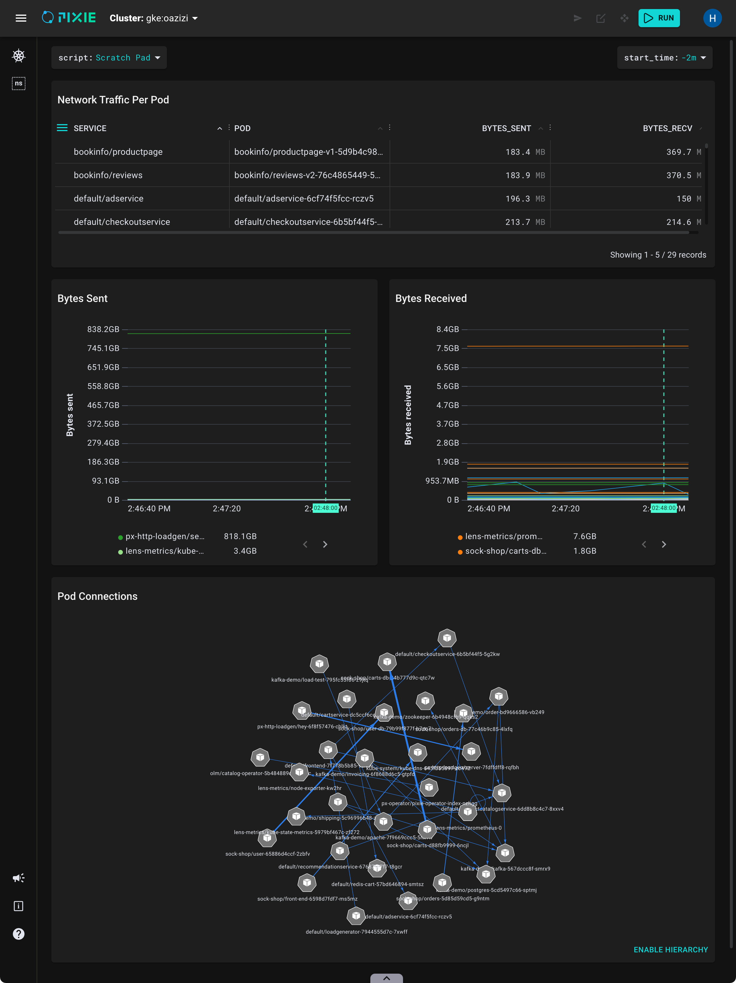
ctrl+enter (Windows, Linux) or cmd+enter (Mac).Your Live UI output should now contain a graph:
Pixie's Live View widgets are interactive.
Here are a sample of ways you can interact with the graph widget:
Click anywhere on the graph to interact. You can pan, zoom, or rearrange individual nodes.
Hover over a graph edge to see edge stats. For this graph, we've configured the edge stats to show total bytes sent and received. Thicker edge lines indicate more bytes received.
Click ENABLE HIERARCHY to see the nodes in a hierarchical layout.
Congratulations, you have finished writing a Vis Spec that displays your Pixie telemetry data in table, time series chart and graph form!
When writing a new PxL script or Vis Spec, it's often easiest to modify an existing script instead of starting from scratch.
Start by identifying a script that does something similar to what you're looking for. The Live UI's script drop-down menu lists all of Pixie's open source scripts along with their descriptions:
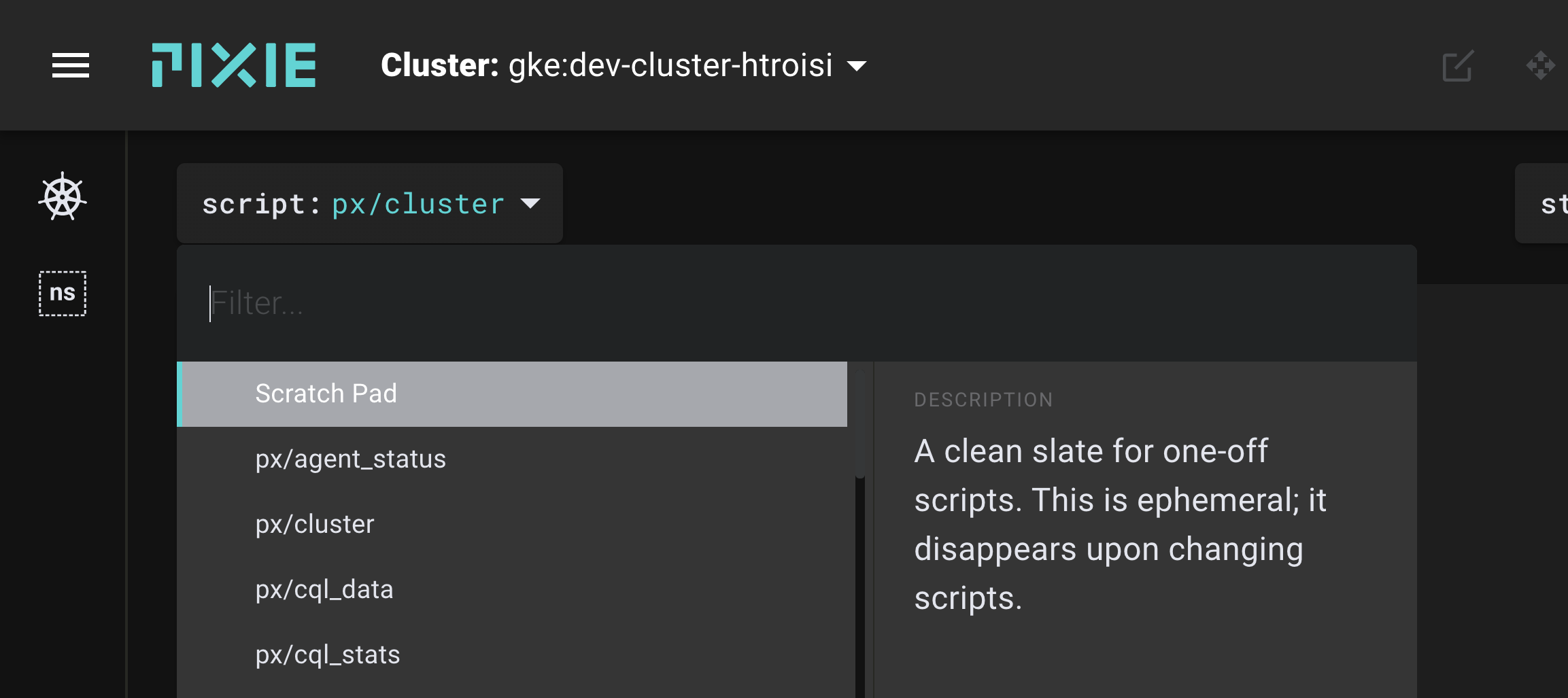
You can also browse the 101 tutorials to see how to use Pixie's open source PxL scripts for specific observability use cases.
Once you identify a PxL script / Vis Spec that does something similar to what you are aiming to do, open the script editor and start modifying the script to convert it into what you want.
