

EXPAND ALL
- Home
- About Pixie
- Installing Pixie
- Using Pixie
- Tutorials
- Reference

In Tutorial #1 we wrote a simple script to query the conn_stats table of data provided by Pixie's platform:
1# Import Pixie's module for querying data2import px34# Load the last 30 seconds of Pixie's `conn_stats` table into a Dataframe.5df = px.DataFrame(table='conn_stats', start_time='-30s')67# Display the DataFrame with table formatting8px.display(df)
This tutorial will expand this PxL script to produce a table that summarizes the total amount of traffic coming in and out of each of the pods in your cluster.
The ctx function provides extra Kubernetes metadata context based on the existing information in your DataFrame.
Because the conn_stats table contains the upid (an opaque numeric ID that globally identifies a process running inside the cluster), PxL can infer the namespace, service, pod, container and command that initiated the connection.
Let's add columns for pod and service to our script.
1# Import Pixie's module for querying data2import px34# Load the last 30 seconds of Pixie's `conn_stats` table into a Dataframe.5df = px.DataFrame(table='conn_stats', start_time='-30s')67# Each record contains contextual information that can be accessed by the reading ctx.8df.pod = df.ctx['pod']9df.service = df.ctx['service']1011# Display the DataFrame with table formatting12px.display(df)
px live -f my_first_script.pxl
Your CLI output should look similar to the following:
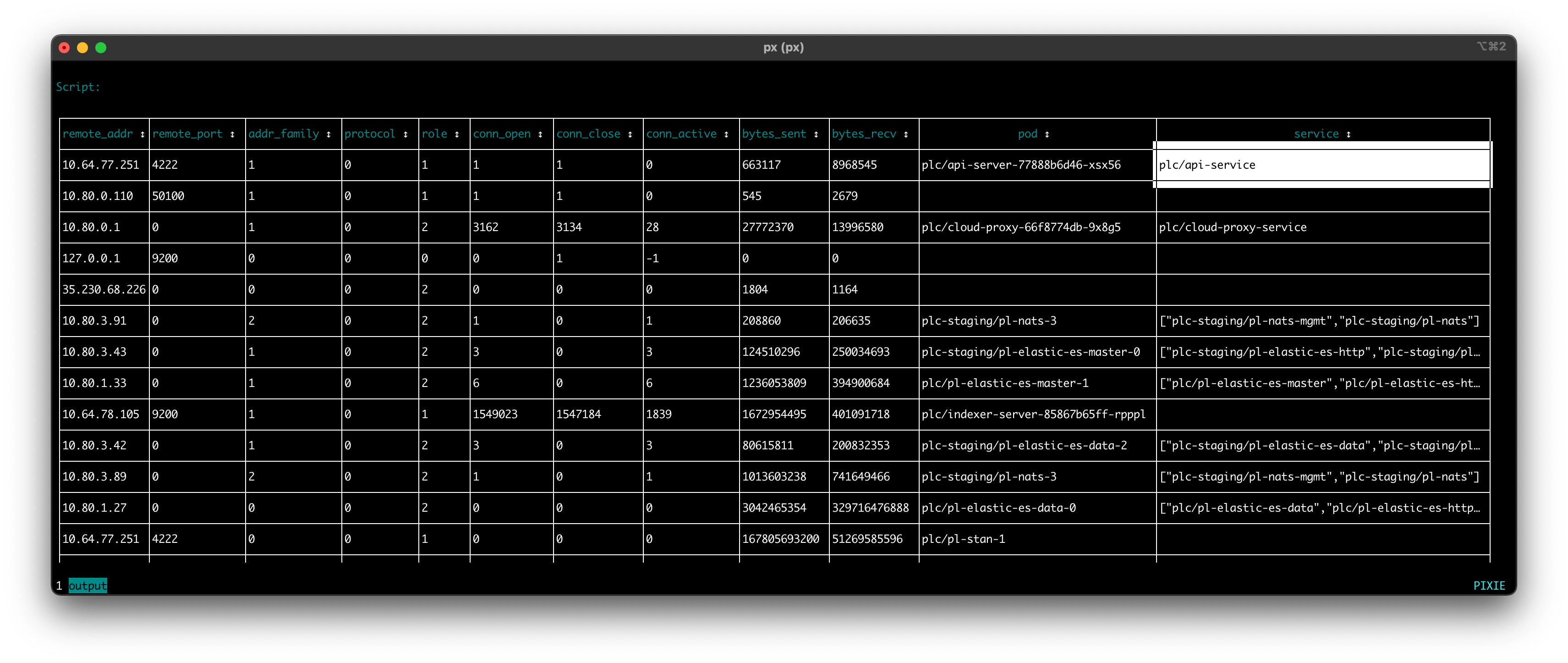
Use your arrow keys to scroll to the far right of the table and you should see a new columns labeled
podandservice, representing the kubernetes entity that initiated the traced connection. Note that some of the connections in the table are missing context (apodorservice). This occasionally occurs due to a gap in metadata or a short-livedupid.
Let's group the connection data by unique pairs of values in the pod and service columns, computing the aggregating expressions on each group of data.
1# Import Pixie's module for querying data2import px34# Load the last 30 seconds of Pixie's `conn_stats` table into a Dataframe.5df = px.DataFrame(table='conn_stats', start_time='-30s')67# Each record contains contextual information that can be accessed by the reading ctx.8df.pod = df.ctx['pod']9df.service = df.ctx['service']1011# Calculate connection stats for each process for each unique pod.12df = df.groupby(['service', 'pod', 'upid']).agg(13 # The fields below are counters per UPID, so we take14 # the min (starting value) and the max (ending value) to subtract them.15 bytes_sent_min=('bytes_sent', px.min),16 bytes_sent_max=('bytes_sent', px.max),17 bytes_recv_min=('bytes_recv', px.min),18 bytes_recv_max=('bytes_recv', px.max),19)2021# Calculate connection stats over the time window.22df.bytes_sent = df.bytes_sent_max - df.bytes_sent_min23df.bytes_recv = df.bytes_recv_max - df.bytes_recv_min2425# Calculate connection stats for each unique pod. Since there26# may be multiple processes per pod we perform an additional aggregation to27# consolidate those into one entry.28df = df.groupby(['service', 'pod']).agg(29 bytes_sent=('bytes_sent', px.sum),30 bytes_recv=('bytes_recv', px.sum),31)3233# Display the DataFrame with table formatting34px.display(df)
Pods can have multiple processes, so on
line 12we group our connection stats by uniqueservice,podandupidpair. Later in the script, we will aggregate the connection stats into a single value per pod.
The
conn_statstable reference docs show that thebytes_sentandbytes_recvcolumns are of typeMETRIC_COUNTER.
Since we're interested in knowing the number of bytes sent and received over the last 30 seconds, we calculate the
min(starting value) and themax(ending value) for each unique pod process. Online 22we subtract these two values to find the total bytes sent and received over the time window.
On
line 28, we group the connection stats for each unique pod, aggregating the values for each pod process.
ctrl+c and re-run the script.Your CLI output should look similar to the following:
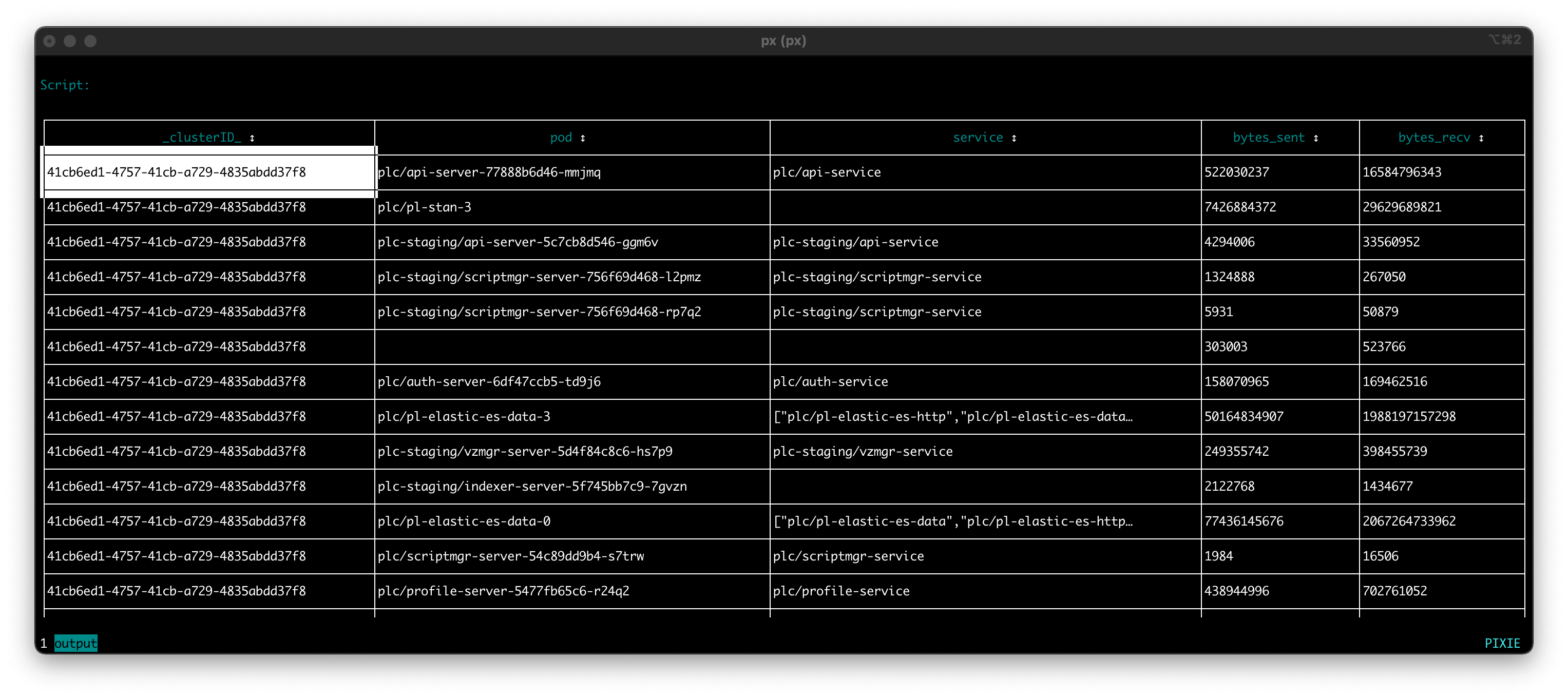
Each row in the output represents a unique
podandservicepair that had one or more connections traced in the last 30 seconds. All of the connections between thesepod/servicepairs have had their sent- and received- bytes summed for the 30 second time period.
Let's filter out the rows in the DataFrame that do not have a service identified (an empty value for the service column).
1# Import Pixie's module for querying data2import px34# Load the last 30 seconds of Pixie's `conn_stats` table into a Dataframe.5df = px.DataFrame(table='conn_stats', start_time='-30s')67# Each record contains contextual information that can be accessed by the reading ctx.8df.pod = df.ctx['pod']9df.service = df.ctx['service']1011# Calculate connection stats for each process for each unique pod.12df = df.groupby(['service', 'pod', 'upid']).agg(13 # The fields below are counters per UPID, so we take14 # the min (starting value) and the max (ending value) to subtract them.15 bytes_sent_min=('bytes_sent', px.min),16 bytes_sent_max=('bytes_sent', px.max),17 bytes_recv_min=('bytes_recv', px.min),18 bytes_recv_max=('bytes_recv', px.max),19)2021# Calculate connection stats over the time window.22df.bytes_sent = df.bytes_sent_max - df.bytes_sent_min23df.bytes_recv = df.bytes_recv_max - df.bytes_recv_min2425# Calculate connection stats for each unique pod. Since there26# may be multiple processes per pod we perform an additional aggregation to27# consolidate those into one entry.28df = df.groupby(['service', 'pod']).agg(29 bytes_sent=('bytes_sent', px.sum),30 bytes_recv=('bytes_recv', px.sum),31)3233# Filter out connections that don't have their service identified.34df = df[df.service != '']3536# Display the DataFrame with table formatting37px.display(df)
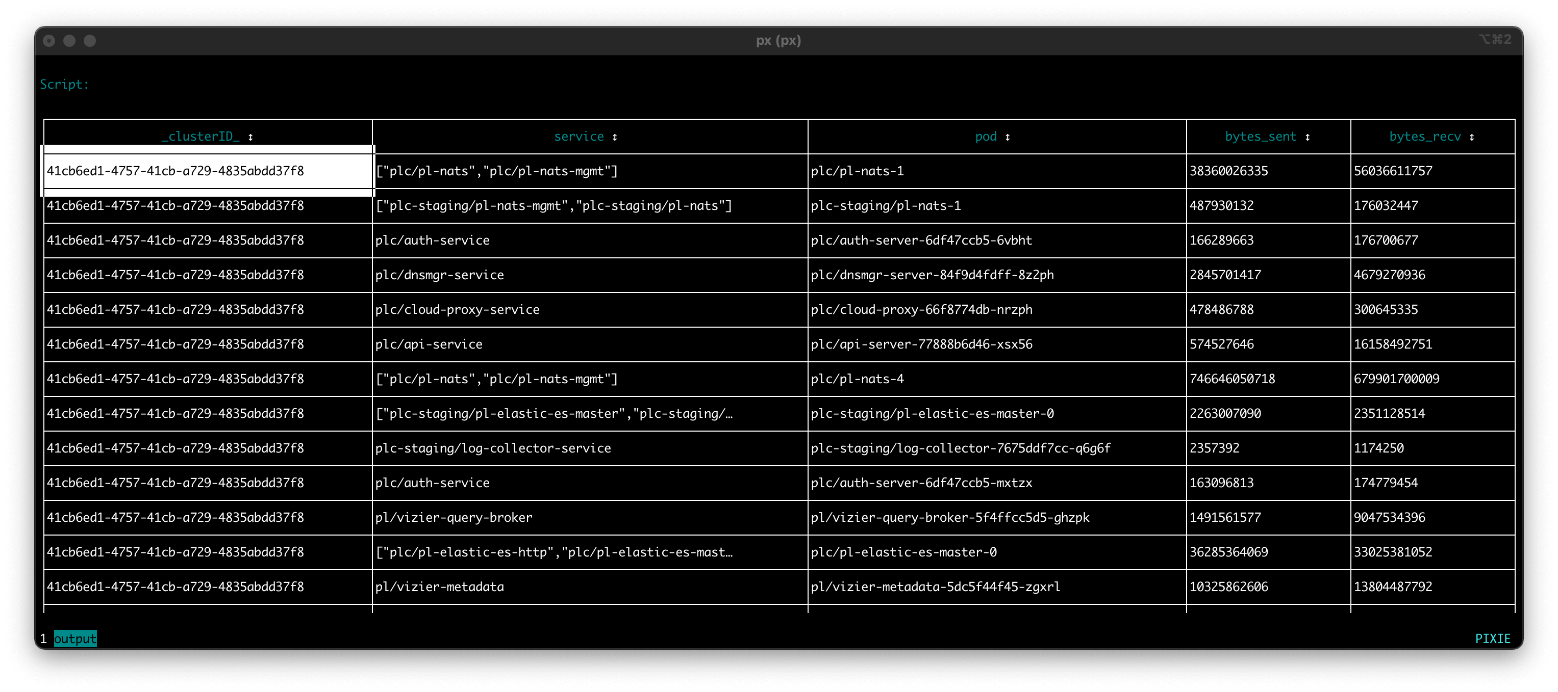
ctrl+c and re-run the script.Your CLI output should look similar to the following. Note that the script output no longer shows rows that are missing a
servicevalue.
Congrats! You have written a script that produces a table summarizing the total amount of traffic coming in and out of each of the pods in your cluster for the last 30 seconds.
This script could be used to:
pod's incoming vs outgoing traffic.pods under the same service receive a similar amount of traffic or if there is an imbalance in traffic received.In Tutorial #3 we will learn how to add more visualizations for this script.
